

MICHAEL MASUMOTO'S GRAPHIC DESIGN GALLERY
NARRATED BY THE ARTIST: SEPTEMBER 2018
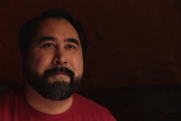
MICHAEL MASUMOTO - SELF PORTRAIT (2014)
This self portrait is a digital painting that I executed in 2014 as cover artwork for my piano sonata. I'm rather proud of the way it came out! Here's how it looked on the book itself:
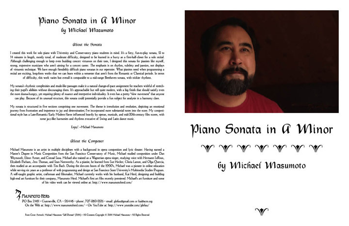
MASUMOTO PIANO SONATA COVER (2014)
Unfortunately, I didn't realize that the final print job would obscure the paint details of my self-portrait. I should have used a more impressionistic style and a fatter brush!
The early part of my career involved a great deal of book design, so I still enjoy laying out books once in a while.
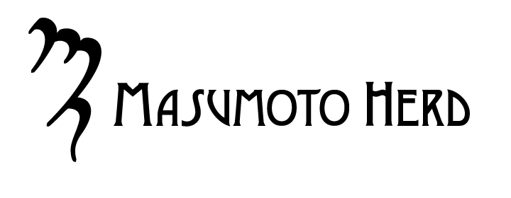
Masumoto Herd Logo (2010)
When Kai and I first opened Masumoto Herd, we consulted an Arts business expert. She suggested that we give our logo a feeling of obscurity and mystery - reflected in my design of a stylish cypher - to make our business seem more exclusive. In retrospect, I believe this logo represents a missed opportunity. A logo should communicate something intangible and essential about a business that is memorable and genuine. This logo is too severe, it doesn't say enough.
Kai really loves the design, so we still use this logo for the Art Furniture side of our business; the cypher itself can be used as a brand to be burned into the furniture as a maker's mark. But I think the Fantasium, with its unusual silhouette and striking design, makes a more suitable logo for Masumoto Herd.
MASTODON ROCK
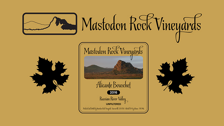
Mastodon Rock Vineyards Logo and Label (2016)
As part of my portfolio development, I created an imaginary small business, "Mastodon Rock Vineyards."
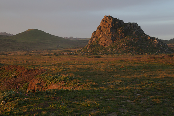
Mastodon Rock (2016)
Here is the photograph I took of a real place in California's state park system. It is located on the coast at the edge of Sonoma County's wine country, on the Kortum Trail close to Goat Rock near the town of Jenner. I call this spot Mastodon Rock because I believe there are rubbed spots where Mastodons supposedly scratched themselves. It doesn't really have a name that I'm aware of.
For the wine label, I chose to go with a more expensive, full-color photographic image, the picture was so appealing. Were clients to ask for a lower-cost, single-color option (common with wines to be cellared), the black-and-white logo could be switched in easily.
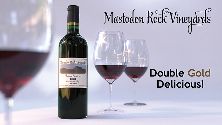
Mastodon Rock Vineyards Ad (2016)
I created a sample advertisement to show my approach to the look of the Mastodon Rock promotional materials. This sample is not a photo, it's a piece of digital art I created using Blender 2.77a, an open-source 3D modeling and rendering package. The wine glasses are copies I modeled from Schott Zwiesel Tritan Cru glasses, which the Wall Street Journal ranked very highly.
REAL WORLD LOGOS
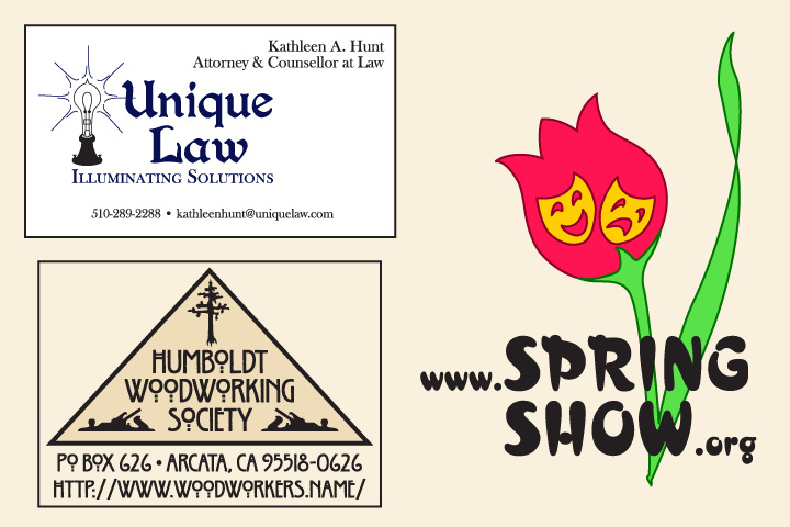
Real World Logos Set #1 (2016)
My Unique Law branding has worked well for attorney Kathleen Hunt. She was drawn to Victorian-era styles, so I developed this retro-professional look for her. It implies outside-the-box thinking and quirkiness combined with a comfortable sense of tradition and solidity, which is the essence of both her and her practice, in my opinion. Her old-style printed business cards receive consistent praise from clients, she informs me. I'm thrilled that her business has grown so successfully, but I was just supporting the excellence of her work.
I was on the Board of Directors for the Humboldt Woodworking Society several years ago. We were suddenly running the largest woodworking show on the North Coast, so our group desperately needed a more professional look for the upcoming media push. The Arts-and-Crafts era is deeply embedded in the psyche of the Northern California woodworking community. I drew the hand plane logos (the locally-recognized trademark of the organization) from a still-in-service 19th century tool in the possession of one of my husband's colleagues.
The Spring Show was a proposed North Coast Musical Theater organization which never materialized. However, everyone liked my logo.
The Spring Show logo says Spring, Fun, Theater! From this remove, I really love the subtlety of the "singing" tulip. The lack of obviousness differentiates this logo from those of most community musical organizations, which usually have a string of musical notes coming out of whatever. The clean, crisp design says, "Professional but Not Stuffy." I would never have overlapped the image and text for a corporate logo, but, for this particular arts non-profit, I think the layout contributes to the core message of fun unconventionality designed to appeal to the region's Bohemian theatrical base.
HAPPY MILK
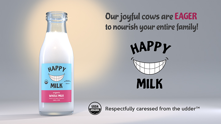
Happy Milk Ad (2016)
Happy Milk is another imaginary product. This ad is also 3D digital art I made using Blender 2.77a. This picture is NOT a photograph, it's a 3D rendering. Even the milk froth is a painting that I applied to the inside of the 3D bottle model!
OK, so this ad is not in the best of taste. Honestly, I came up with the idea and burst out laughing. Sex sells, right? But this absurd campaign does accurately reflect the goofy/sophisticated nature of my sense of humor, both sweet and sarcastic. This approach might sell milk to a sophisticated niche market. Science fiction fans, gay men, computer nerds. My people! You would have to sell "Cream," too. Such a great mixer for Kahlua cocktails!
I believe that the essence of the campaign would be feigned cluelessness, as if we did not entirely understand what we were suggesting. How wholesome this product is, how morally upright! An essential part of a balanced breakfast! The faintest whiff of blatantness, and the campaign would disintegrate. Some people wouldn't appreciate it... my mother rolled her eyes and said dryly, "How tasteful." But I know people who would definitely buy this product.
Additional Artworks
Michael works in a variety of media, both physical and digital. Click the links below to see additional samples of his work.
- Commercial Graphic Design
- Photography
For more about Michael's musical work, please visit the Music section of this website. For more about Michael's movie and motion graphics work, please visit the Video section of this website. And, of course, for more about Michael and Kai's physical multimedia projects, please visit our Art Furniture section. Thanks!
Last Updated: September 30, 2018
COPYRIGHT © 2010-2018 MICHAEL MASUMOTO